Just Wright Communications
+1 612.991.1809
  • Home
  • Client work
    • About
  • Contact

Mourning the loss of Enzo Mari, Italian designer/architect

10/25/2020

0 Comments

 
Picture
Picture
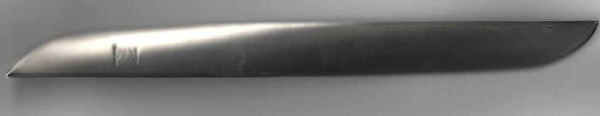
RECENT NEWS of the great Italian architect/designer Enzo Mari's death brought back memories of my own appreciation of his design work on everyday items like this Ameland Letter Knife design by him and introduced to market in 1962 by Danese Milano. It is difficult to find these days, and Danese Milano no longer carries it in their online catalog. However, it can still be found on the nova68 website of modern design objects and furniture.

I wrote a tribute to this beautiful object for the April 2011 issue of PRINT magazine in the regular column "One Perfect Thing."

Here is my story in total:
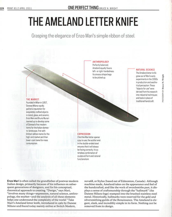
Enzo Mari is often called the grandfather of postwar modern Italian design, primarily because of his influence on subsequent generations of designers, and for his conceptual, theoretical approach to creating. “Design,” says Mari, “involves many things — expression, natural science, anthropology, the market — and the analysis of all these elements helps one understand the complexity of the world.” Take Mari’s Ameland letter knife, introduced in 1962 by Danese Milano and found today mainly online at Switch Modern, nova68, or Stylus (based in Edmonton, Canada.) Although machine-made, Ameland takes on the appearance and feel of the handcrafted, and like the work of swordsmiths past, it displays a sense of craftsmanship through the “hallmark” (the Danese Milano logo) stamped into the brushed stainless steel metal. Historically, hallmarks were reserved for the gold and silversmithing guilds of the Renaissance. The Ameland is elegant, sleek, and incredibly simple in its form. Nothing can be removed from its design.

THE MARKET
Founded in Milan in 1957, Danese Milano rapidly gained a reputation for exquisitely crafted objects in metal, glass, and ceramic. Enzo Mari and Bruno Munari teamed up to develop some of Danese’s first modern items for the Italian domestic landscape, first with limited-edition items for the high-end market and then lower-cost items for mass consumption.
 
ANTHROPOLOGY
Perfectly balanced, Ameland equally favors left- or right-handedness. Its sinuous shape begs to be picked up.
 
EXPRESSION
I find the Mari letter opener a joy to use, the subtle twist in the double-ended steel ensures that it will always be facing correctly. It is a timeless combination of sculptural form and rational functionalism.
 
NATURAL SCIENCE
The Ameland letter knife grew out of Mari’s early experiments in the 1950s in production and aesthetical perception. These “objects for use” were derived from his research into industrial techniques and tools in place of traditional handicraft.

0 Comments

Making the case for fabric: commercial shade that unifies public gathering spaces

8/30/2020

0 Comments

 
Picture

[This article originally appeared in the June 1, 2020 online issue of Fabric Architecture.]

By Bruce N. Wright, FAIA
“The architecture teleports you to a bazaar in a faraway land!”—Yelp report from a recent visitor to the Irvine Spectrum shopping mall in Irvine, Calif. 
​

Many visitors, like the one commenting on Yelp, are drawn back again and again to this Southern California shopping mall because of the enticing atmosphere of the mostly outdoor, inward-facing retail and entertainment center. It’s not surprising, given that the scale and architectural detail of this pedestrian-favored hub is based on the Alhambra, the famous and historic 18th century palaces and gardens located in Granada, Spain.
The original Alhambra is known for its fountains, gardens, running water, gates that demarcate sections, public squares known as souks, narrow streets and lots of sun. The same is true of Irvine Spectrum, which has all of these features and more, including a giant Ferris wheel, a 21-screen movie theater and the major retail anchors Nordstrom and Target. Macy’s held down a third corner but closed recently and will be replaced by up to 20 new stores.
Irvine Spectrum has been developed over several years, with its first phase completed in 1995. A second phase was added in 1998. Runaway popular success kept the posh lifestyle center growing with a third phase of construction added in 2002 and two more expansions in 2005 and 2006. However, too much of California’s unrelenting sun led to the call for serious shading to mitigate the blistering heat. With no air conditioning, except inside individual stores, the sweltering streets of Irvine Spectrum started to drive people away. J. Miller Canvas LLC, Santa Ana, Calif., was called upon to install a series of shades that would shelter shoppers from the sun while preserving streets with a feeling of openness and free-flowing space.
Initial cable-strung fabric shades were installed at roof height in 2016 and proved so transformative that J. Miller Canvas has been brought back for several additional installs to continue providing cooler passages while maintaining the open feeling of the shopping center.
Design of the cable-supported strips of shade cloth—dubbed “Paseo Banners,” says Dan Neill of J. Miller Canvas—“was a team effort from all parties: the architect, owner and us. Hundreds of yards of fabric, with varying degrees of opacity, were used to create very distinct shade patterns on walkways and walls.” The intent was to replicate dappled patterns on the pavement as if from trees and vines. The result is a subtle, mesmerizing and almost subconscious reference to the original Alhambra in Spain. “It creates a sort of sanctuary for people,” says Neill. And it works. People are coming back and shopkeepers are pleased with the results of a revived retail center.
“The majority of pedestrian streets at Spectrum now have these Paseo Banners installed,” says Neill, “but we are still being asked periodically to install panels throughout the mall.” He estimates that a total of about 13,000 square feet of fabric is up doing its work. In the end, fabric canopies, instead of heavier metal or cementitious materials, were the wise choice, as the client “did not want to lose the outdoor feel of the shopping center,” says Neill. “And the large spans required for a solid structure would have been too heavy and too expensive.” 


Project detailsIrvine Spectrum Paseo Banners
Client: The Irvine Corp. Developer
Architect: Architects Orange
Design/Fabrication: J. Miller Canvas, LLC
Installation: Eventstar Structures
Fabrics: Firesist® from Glen Raven Custom Fabrics, LLC; Soltis 92 from Serge Ferrari North America Inc.

​Bruce N. Wright, FAIA, is an architect and consultant to architects. He is a senior instructor at Dunwoody College of Technology and frequent contributor to IFAI publications.
0 Comments

1956: The year MoMA was overrun with textiles

6/10/2018

0 Comments

 
Picture
Museum of Modern Art (c)

In 1956, few people could have guessed that the Museum of Modern Art would take mundane industrial-strength textiles out of the workaday world and put them on display in its modernist New York galleries. MoMA's curator of architecture and design, a young 31-year old Arthur Drexler, felt otherwise: "Industrial fabrics rarely, if ever, are designed for aesthetic effect, yet they seem beautiful largely because they share the precision, delicacy, pronounced texture and exact repetition of detail characteristic of 20th century machine art."

My article about that exhibition was published in the September 2017 issue of Specialty Fabrics Review under the title "What is art?"

It was a time of major changes in art and perception, with New York serving as the hub of most artistic creation and display in America. At the August 29 debut of “Textiles U.S.A.” the Museum of Modern Art (MoMA) was a still-young 17-years old, and the only major institution in New York devoted to modern art in all its forms, including architecture and industrial design. Frank Lloyd Wright’s inverted spiral ziggurat for The Solomon R. Guggenheim Museum was in construction but still three years away from opening. Abstract expressionist artists like Franz Kline, Willem de Kooning and Jackson Pollock had come into their own after World War II and Dada artists like Marcel Duchamp and Pop Artists such as Jasper Johns and Robert Rauschenberg were questioning the very meaning of art at its foundation.

DESIGNING WITH TEXTILES
Given these challenges to what constituted art, it is not surprising the MoMA curators found the recent introduction of synthetic textiles, with all of their saturated colors and new textures, attractive as a subject for serious examination. A New York Times art critic, on reviewing the Textiles U.S.A. show asked, “Just what has this exhibition, 90 percent machine-produced and principally directed to the industrial market, got to do with ‘art’?” He went on to applaud the curators for bringing many exciting textiles and patterns to the public’s attention in what he described as “one of the most lavish and imaginative exhibitions ever installed here and the first to be devoted exclusively to American fabric design.”
    “In presenting such an exhibition,” he continued, “the Museum of Modern Art recognizes the obvious fact that the field of industrial design increasingly attracts genuinely gifted young men and women who years ago would have been sitting solitary, irresolute and bored in front of an unfinished canvas.”
    Some of those gifted young men and women included Alexander Girard, architect and textile designer from New Mexico for the Herman Miller Furniture Co upholstery fabrics; Florence Knoll for the Knoll Planning Unit upholstery fabrics; Marc Chagall, the Russian-French modernist artist, designing printed fabrics for wall coverings; and Jack Lenor Larsen, for his own furnishings company as well as for U.S. Rubber Co. for a line of upholstery fabric called “Trilok”, a complex of linen, mohair, viscose, cotton and polyethylene. The exhibition catalog described this construction as “double weave with alternating stripes in yellow, white and green."
    MoMA dedicated its entire first floor to the show and to the museum’s open-air garden terrace, overseen through a glass wall from the main exhibition gallery. A press release from the museum described the terrace portion of the show: “An awning of Herculite, a Fortisan mesh laminated between clear plastic, runs the length of the terrace. At the other end of the terrace, two regulation air force parachutes are hung from the awning, one of magenta Day-Glo ribbons, the other of white and orange nylon.”

FUNCTION WITH STYLE
Longtime IFAI member, Sy Hyman, now retired CEO of Herculite, well remembers the excitement and importance of the MoMA exhibition to the specialty fabrics industry: “During that early period of Herculite company formation we developed a clear, strong and waterproof, high (artificial and sun) light transmission laminate. It served as a fabric upgrade to opaque, moisture seep-through cotton duck,” common at the time he says. It was a new textile promoted to national utilities as a shelter material for telephone linesmen. “The folks at MoMA were so excited about the properties of this fabric, they ordered a huge extended canopy covering a large portion of their garden exhibit.” As Burlington Fabrics Corp. was the main supplier of woven scrim to Herculite, and was a MoMA sponsor to Textile U.S.A., Hyman suspects they were the ones who brought this new industrial fabric to the attention of the museum curators.
    Selection of the 190 fabrics chosen for display was accomplished by a small team of reviewers led by newly appointed, 31-year-old director of the museum’s architecture and design department, Arthur Drexler. Sorting through more than 3,500 entries of fabrics with Drexler were 11 jury members including Rene d’Harnoncourt, director of MoMA; legendary architect and the museum’s first director of the architecture and design department, Philip C. Johnson; William C. Segal, editor of American Fabrics Magazine, co-sponsor of the exhibition; Anni Albers, textile designer formerly with the Bauhaus faculty during the 1930s; and Mary Lewis, fashion director for the department store giant, Sears. American Fabrics Magazine devoted the entire fall 1956 issue of the magazine to the show.
    Commenting on the industrial section of the exhibition, Drexler said: “Many industrial fabrics inadvertently heighten properties familiar to us in other materials. The blond opulence of loosely plaited tire cord, though it is always hidden within layers of rubber, rivals fabrics used for formal gowns. Day-Glo, a chemical treatment, makes color reflect with a new clanging, eye-splitting luminosity. Often such fabrics are eligible for other uses: the manufacturer of a sludge filter, resembling homespun, disposed of some extra yardage to a men's tailor. Industrial fabrics rarely, if ever, are designed for aesthetic effect, yet they seem beautiful largely because they share the precision, delicacy, pronounced texture, and exact repetition of detail characteristic of 20th century machine art.” Drexler was quoted in a newspaper review of the show as calling the rayon lining of auto tires as the “Marilyn Monroe of fabrics.” “This stuff is incredible,” he said, “It sways, it ripples, it’s the most luscious material you’ve ever seen.”
    The memory of the opening of that landmark exhibition is still vivid in Hyman’s memory: “Ironically, there occurred a heavy rainstorm during the opening night, wherein the unique outdoor Herculite structure provide protection to the important evening museum attendees. This feature was duly noted by the New York Times’ art editor in his review.” “We assume that the fabrics ‘work,’” wrote Stuart Preston in the September 2, 1956 Times, “and were indeed grateful, on the exhibition’s wet opening night, that the awning of Herculite, a nylon mesh laminated between clear plastic, kept the rain off the terrace.”

0 Comments

The inside story: fabric in entertainment

3/8/2018

0 Comments

 
Picture
My latest article, published in the March Specialty Fabrics Review:
"Textiles are often the A surface in a space, the surface that most closely interacts with the user," says Catherine Stowell, director of design for Designtex. "This means they are a valuable opportunity to make a direct impression, especially in entertainment environments."

Photo: Camira Fabrics (c)
Read the full article here
Click to set custom HTML
0 Comments

New Lt wt materials make mobile architecture move

8/25/2016

0 Comments

 
Picture
Photovoltaic canopy powers the iced-coffee cart in Brooklyn, NYC.  Photo courtesy: Pvilion LLC (c)
My latest article for Advance Textiles Source is a two-part series on new materials and portable structures. Read what new examples and materials I've found at this link.

Down to earth; up in the air, Part Two
Balancing act with new materials for portables
 
By Bruce N. Wright
For Harry Osborne, creative lead at SET-Live, the graphic applications and collection of temporary structures throughout the “Google on the Beach 2015” (GoB) event was an exercise in balance. A “Balance between getting the most from Anthony Burril’s incredible artwork,” * says Osborne, “but also [of] satisfying the local council’s requirement for everything built on the beach to be predominately white when viewed from the Croisette (the beach side promenade of Cannes, France). Balance also, between the need to bring a diverse selection of Google product brands together with a look and feel developed specifically for the beach and at the same time make the whole thing look seamless, integrated and not like a load of graphic panels stuck to structural walls.”
Continue reading at link....
0 Comments

Flexible PV on a new wave

3/9/2016

0 Comments

 
Picture
Photo: Pvilion
My latest report on the thin-film, flexible PV industry shows there is much to be optimistic about. Read it in the Advanced Textiles Source posting here.
0 Comments

To Build or Not to Build: You Must Ask the Question!

5/20/2015

0 Comments

 
Picture
Excited to have spoken last week at the national AIA convention in Atlanta with partners Thomas Fisher, Assoc AIA, outgoing dean of College of Design University of Minnesota; and Ali Heshmati, AIA, architect and principal of L.E.A.D. Inc, Norway, about our concept of LiTE (Lightweight, inexpensive, Temporal Environments).

Our talk, “To Build or Not to Build: Is That the Question?” was well received and solicited many good responses. We posed the challenge to architects and our profession that as designers we must take into account numerous economic, social, technological and philosophical changes that are rapidly disrupting the status quo across the globe, in order to help societies move forward in a more sustainable way. We do this through analysis of client’s programmatic brief to see if an alternative to a building can meet their needs in a more sustainable manner. With temporary, transportable structures, many programmatic issues can be met without needing to create bricks-and-mortar solutions. The use of pop-up venues, such as a large format stadium that can be set up and taken down when its immediate function has ceased, means that designers can propose low-carbon impact solutions where they're needed at lower financial cost and lower impact on the environment. [See my Feb 2015 blog post about Todd Dalland's temporary skyscraper.]

0 Comments

LIGHTEN UP! Weight(less)-ness as a driver of architecture

2/19/2015

0 Comments

 
Around the world, a major tenet of building is to use solid, heavy materials, the kinds that anchor a building to the ground. After all, the thicker and heavier the stronger, right?

Not so fast. When it comes to earthquakes, the lighter the better. Witness the immeasurably disastrous effect of a magnitude 6.6 earthquake in 2003 in the ancient city of Bam in southeast Iran. Several hundred years of construction and indigenous history were destroyed in the blink of an eye, including 60% of the city’s residential area and major historical and religious structures.

A 2003 BBC News report stated “the collapse of so many modern buildings revealed that building regulations have simply been ignored in the rush to industrialize the mud plains east of Istanbul, despite warnings that this was earthquake territory of the most vulnerable kind.”

It has been suggested that corrupt local building officials with lax or non-compliant codes for proper seismic construction may have contributed to the magnitude of the deaths in that disaster. (Estimates tally the loss of life at more than 26,000 with countless more injured.) But the results had much to do with the method of construction. Built largely of mud-bricks, these structures were ill equipped to resist the lateral forces from such a powerful quake.

As all architects know, the amount of damage a building sustains in an earthquake is largely a function of mass and lateral forces, and proper connection details. The greater the mass the more likely it is to respond to violent swings and the more likely it will incur damage.

Instead, if the exteriors of skyscrapers and other bulky buildings could be clad with lightweight fabrics or foils, the mass of the building would be reduced and the structure that supports it could be lightened as well. Likewise, structural armatures could be knitted or made from lightweight composites with flexibility built in.

In contrast, ancient island cultures located in earthquake-prone zones the record of destruction is virtually nil. With indigent structures mostly constructed of bamboo or highly flexible timbers with thatching for protection, if an earthquake hit buildings simply swayed and shook with the tremors, leaving minor but easy repairs in its wake.

Only since modern times, with steel and concrete buildings, do we find an increase in major disasters after earthquakes. Engineers have been challenged to design ever-higher skyscrapers and to make them earthquake proof, a significant obstacle with increasing weights of building materials.

The fabric-clad skyscraper is an innovative concept first posited by fabric structures architect Todd Dalland in 1993 and subsequently refined to suggest that these towers could be temporary and transportable when their initial purpose has expired.

The irony of the Bam disaster is that historically, the Iranian culture grew out of the nomadic tribes of the Middle East, and their tents — lightweight structures with the ability to bend with the forces — would have minimized the risk to people’s safety.

--BNW

[Adapted from my editorial initially published in 2004]


PictureRecyclable, portable fabric skyscraper. (Design: FTL 1991, used with permission.)

0 Comments

Graphic Design in the 24th Century—Redux

4/19/2014

0 Comments

 
Picture
This retro look at the December 1987 edition of AIGA Minnesota’s newsletter, Issues, (above) has a cover story by yours truly where I attempt to predict the future. You be the judge of how accurate my predictions turned out:

By Bruce N. Wright
“Graphic Design in the 24th Century”

In the Twenty-Fourth Century we will be completely happy. Our every need will be swiftly and silently met by increasingly sophisticated electronics, high-tech, high-touch robots, high-performance vehicles, diagnostic-aerobic-celebrity-recreational centers and video parity.

Everyone will have their own private logo (designed by a licensed graphic designer, of course) and be hyper-conscious of good design in every part of their lives. Contrary to our predictions, publishing will flourish as a consequence of the instant fame syndrome sparked by pop-artist Andy Warhol. Through the miracle of desktop publishing billions of very thin books will be produced representing fifteen minutes in the lives of everyone. And communications will become near instantaneous with the help of neural-cellular telephones that don’t fade in and out. Everything will have been taken care of.

Beyond belief, you say? Well, it’s already been done, or much of it anyway. If you care to see for yourself, every Saturday night on “Star Trek: The Next Generation,” you can watch the crew of the Enterprise battle with aliens, malfunctioning equipment and their own minds while a dazzling display of graphics blinks in the background.

But these are no ordinary graphics. The Starship Enterprise is fully equipped with interactive graphics that give instant information, provide ship controls, or help people find their way around the ship. You could almost say that for the Enterprise, the graphics are the key to control, for in Star Trek, understanding the displays and instruments gives command of the ship.

With the new TV series, graphics plays a greater role than in the original and it is sometimes used as a method of moving the story plot along. In a recent episode, an “alien force” (in the form of a medusa-like bundle of energy with the ability to pass into the minds of one person or another), took control of the ship. It could do this at will, but only through the ship’s control panels, where the advanced interactive graphics are concentrated. In other words, the graphics become the conduit through which the creature could interact with the humans. This makes tremendous sense, for it is through graphics (symbols if you will) that we communicate when we don’t use speech.

The idea of talking to a computer, or a set of signs, goes back many years and has been a favorite gimmick of science fiction writers since the 1940s. (Incidentally, the Bible described a form of interactive graphics when it spoke of the “Burning Bush,” but that’s a study for others to take up.) It is only within the last five years that we have had the capabilities sufficient to the task. And, as technology speeds up, the use of interactive computer graphics will become more and more important as life’s activities become more and more complex. It will be a matter of providing more information to people who need it. We already see such things as electronic yellow pages being promoted on TV through the Connection. These things will need graphic designers to make sense out of them.

There will be innumerable occasions where good graphic communication could help. Take the act of finding one’s way around downtown, or Dayton’s for that matter. With new buildings and changes being made to our urban setting monthly, sometimes weekly, the need for information expands. This touches on one of Bill Stumpf’s favorite subjects, the civility of a place. In a civil society, people can find their way around, and, if they get lost, they are easily able to locate and find the information they seek to get themselves back to where they are going.

Too much of the urban landscape these days is uncared for. There are vast swatches of no-mans-lands where no one is responsible to that land. This is a notion the American Indians believed in, that humans are stewards of the land and must respect it. In France, at least in the southern provinces, every shopkeeper is required by law to keep the patch of sidewalk in front of their store clean at all times.

To the denizens of our great American cities today, the thought that sidewalks and streets should be anyone’s responsibility is beyond comprehension. Of course, it’s somebody else’s job! The same can be said of the responsibility of communication and signage within our communities. Who is responsible for making sure that everyone can find their way around, or that visitors can find goods and services? Too often the work is left to some corporate management that fails to realize that the essentials of communication are the clear and unimpeded transference of information.

There are many opportunities in our own time for good graphic information: building identification, shops, institutions such as our libraries, civic groups, government, transportation systems (the old Paris Metro maps were the original interactive graphics), parking facilities (probably the worst offenders of clear graphic information. People are always losing their cars in parking ramps), and on the simplest level, the company logo as an opportunity to communicate information. How many logos do you see every day that communicate little or nothing of their company’s aspirations or activities?

Society is getting more and more complex. The opportunities are there. It will be up to the astute graphic designer to find new areas of need. Now, more than ever, the world needs capable graphic designers to take the lead in making the world a comprehensible place to live; to go on a continuing mission to seek out new worlds (it’s no longer safe to set five-year missions), and new ways of communicating through graphics.

0 Comments
    Picture

    Bruce N Wright

    Editor | Writer | Wordsmith

    Archives

    August 2020
    June 2018
    March 2018
    August 2016
    March 2016
    May 2015
    February 2015
    April 2014

    Categories

    All
    AIGA 100 Years Of Graphic Design
    AIGA Minnesota
    Design History
    Graphic Design
    Graphics
    Wayfinding

    RSS Feed

Powered by Create your own unique website with customizable templates.